Web Design and UX/UI Case Study

Village of Endeavor

I redesigned the Village of Endeavor digital experience to help residents, businesses, and visitors find civic services faster. My work focused on research, information architecture, mobile responsiveness, accessibility, and a cleaner municipal interface.

Web
Project type
UX/UI
Role focus
Civic
Audience
Client / Brand

Village of Endeavor

A growing municipality seeking a clearer, more useful digital presence for residents, local businesses, and visitors.

Role

UX/UI Designer

Research, information architecture, responsive UI direction, accessibility considerations, and final case-study presentation.

Tools

Figma + Research Tools

Figma, Microsoft Teams, Google Forms, Google Sheets

The challenge

Modernizing a municipal website without losing trust or clarity.

The existing municipal website was difficult to navigate, visually outdated, and not optimized for mobile users. Residents and local businesses had trouble locating permits, ordinances, police information, community updates, and essential service documents.

Objective

Create a clearer, more accessible, mobile-first website experience that supports transparency and improves access to critical services.

Audience

Residents, local businesses, visitors, village staff, and community members who need fast access to civic information.

Constraints

The redesign needed to respect a government-appropriate tone, organize a wide range of public information, and work well on mobile devices.

My responsibility

I led the UX/UI direction from research to presentation.

As the lead UX/UI designer, I reviewed user needs, organized civic content into clearer pathways, planned a responsive interface, and shaped a visual direction that supports transparency and everyday use.

Selected responsibilities

These responsibilities map directly to the new ACF system and give recruiters a fast way to understand the project scope.

Process

A practical civic redesign process built around access to information.

Step 01

Discovery and client needs

I reviewed the current presentation and identified the main usability issues: disorganized navigation, dated visuals, limited mobile responsiveness, and difficult access to important service information.

Step 02

Research and interviews

I created a focused questionnaire to better understand resident and stakeholder needs, especially around finding forms, announcements, departments, and civic resources.

Step 03

Information architecture

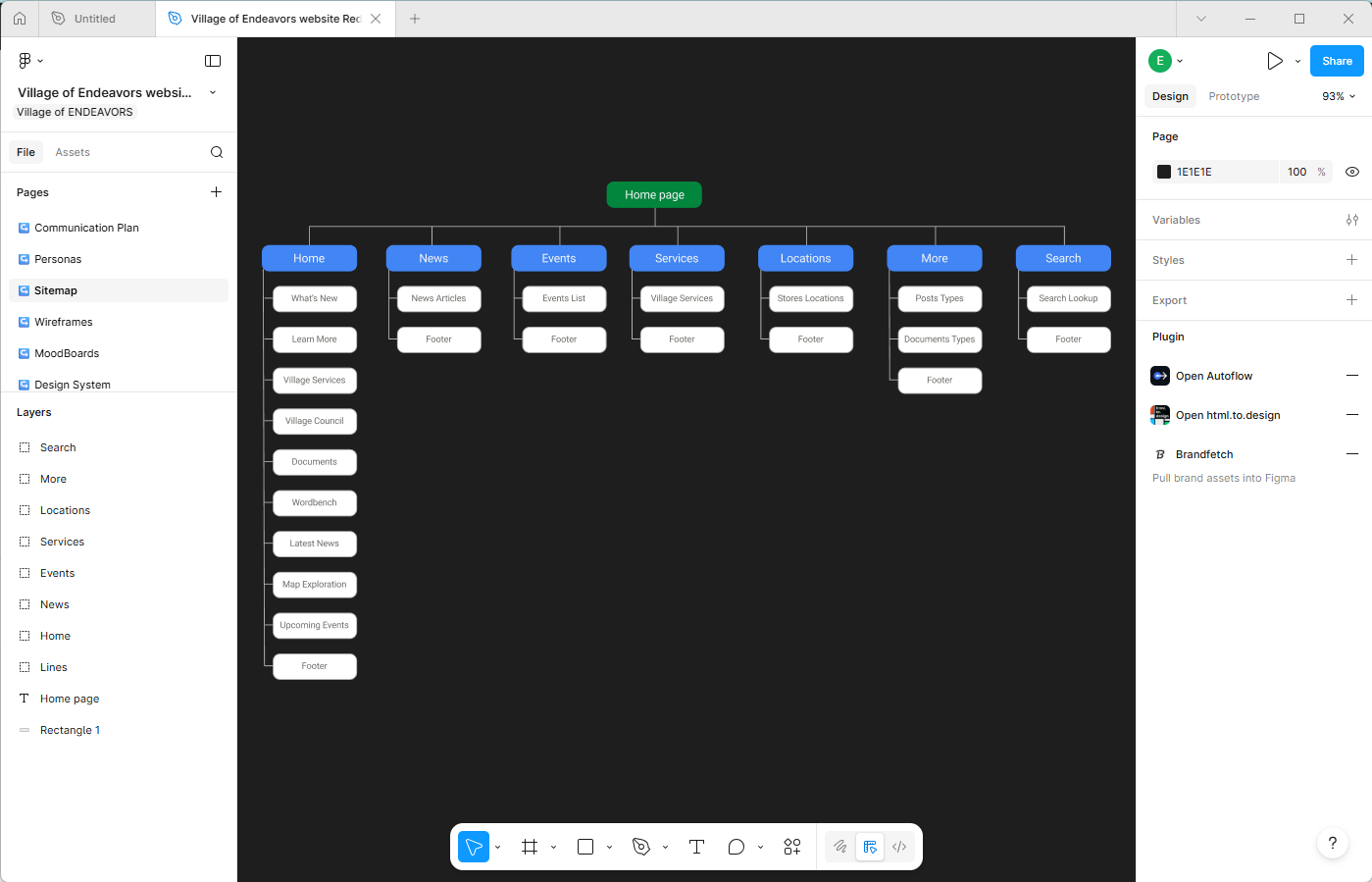
I reorganized the experience around high-priority tasks such as permits, ordinances, police information, rental agreements, and community updates.

Step 04

Responsive interface design

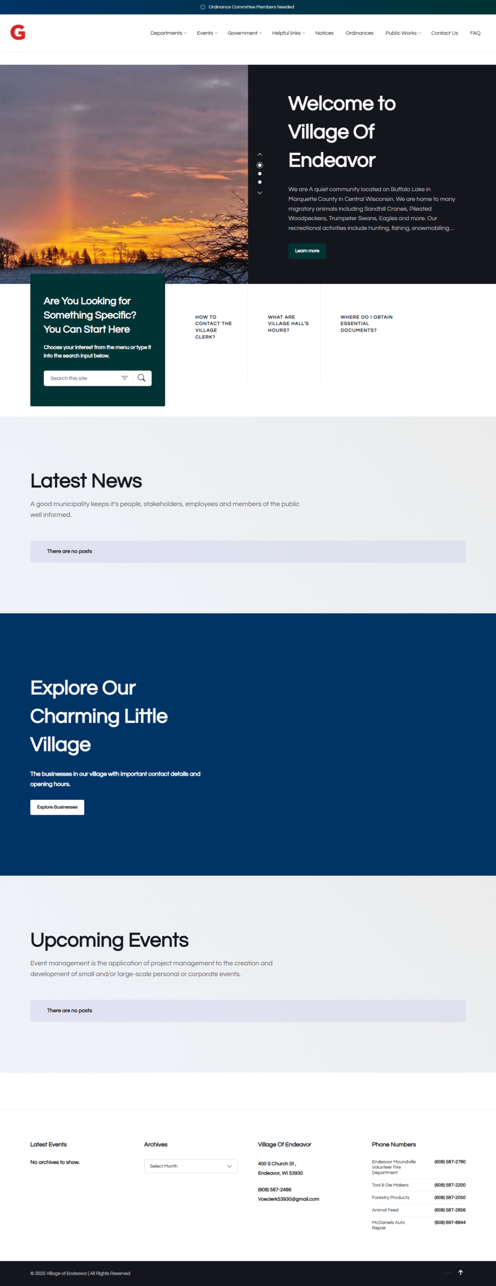
I shaped a cleaner municipal interface with stronger hierarchy, mobile-friendly sections, and a visual tone that feels professional without becoming overly corporate.

Design decisions

The key decisions were about clarity, access, and civic trust.

For a municipal website, design quality is not just visual polish. The experience must help people complete real tasks quickly, read information clearly, and trust that the organization is reliable.

Simplified service navigation

Reason: Municipal users often arrive with a specific task, not time to browse.

Impact: The structure makes important services easier to scan and access.

Mobile-first hierarchy

Reason: A significant portion of residents may access civic information from phones.

Impact: The redesign supports faster reading and better access across device sizes.

Professional civic visual tone

Reason: The site needed to feel modern without losing the trust expected from local government.

Impact: The final direction feels credible, organized, and community-focused.

Final work

A cleaner presentation for key municipal pages.

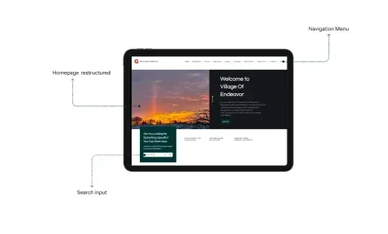
Homepage direction with clearer entry points and stronger civic hierarchy.

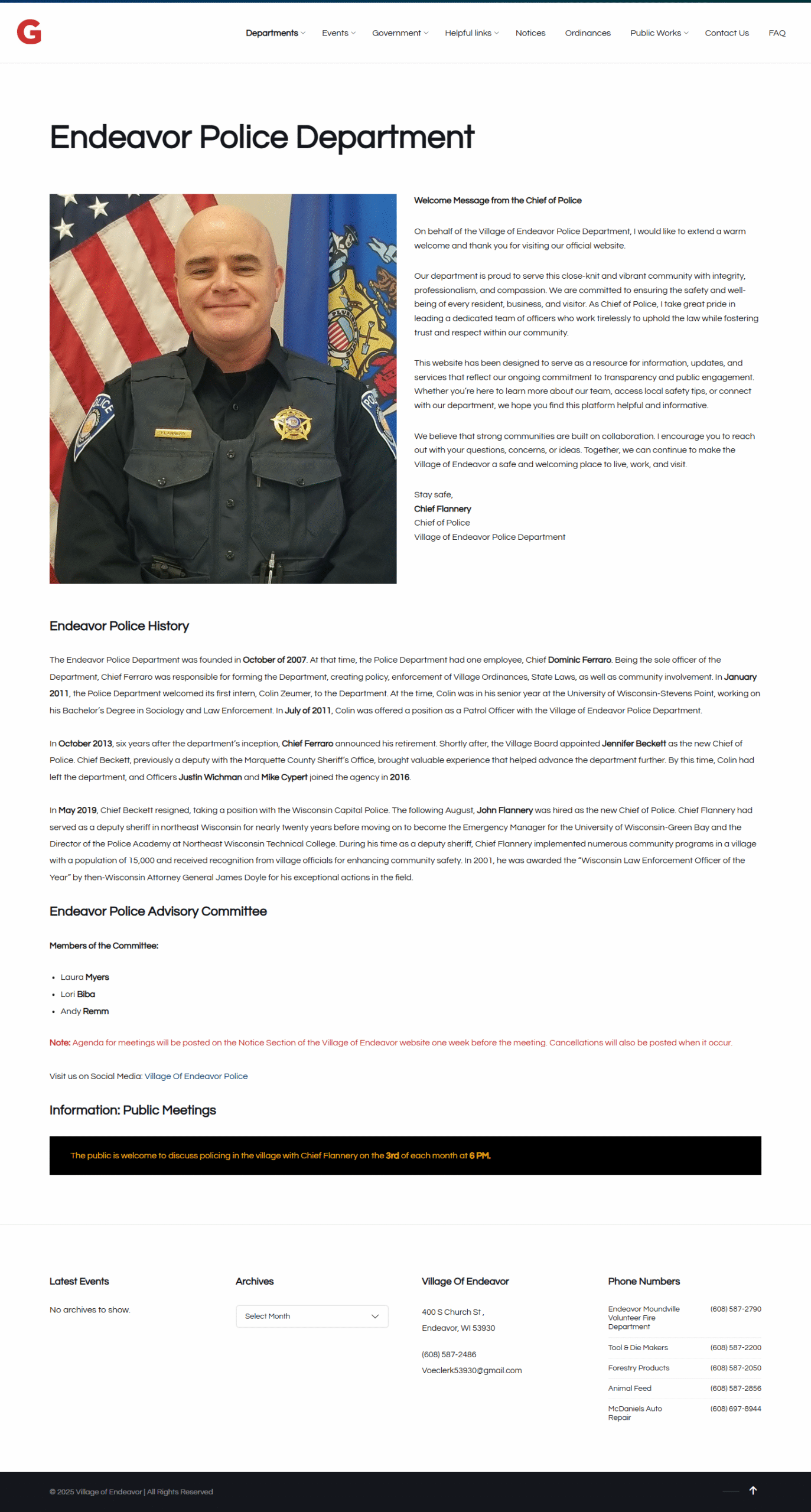
Department pages organized for faster access to essential public-service details.

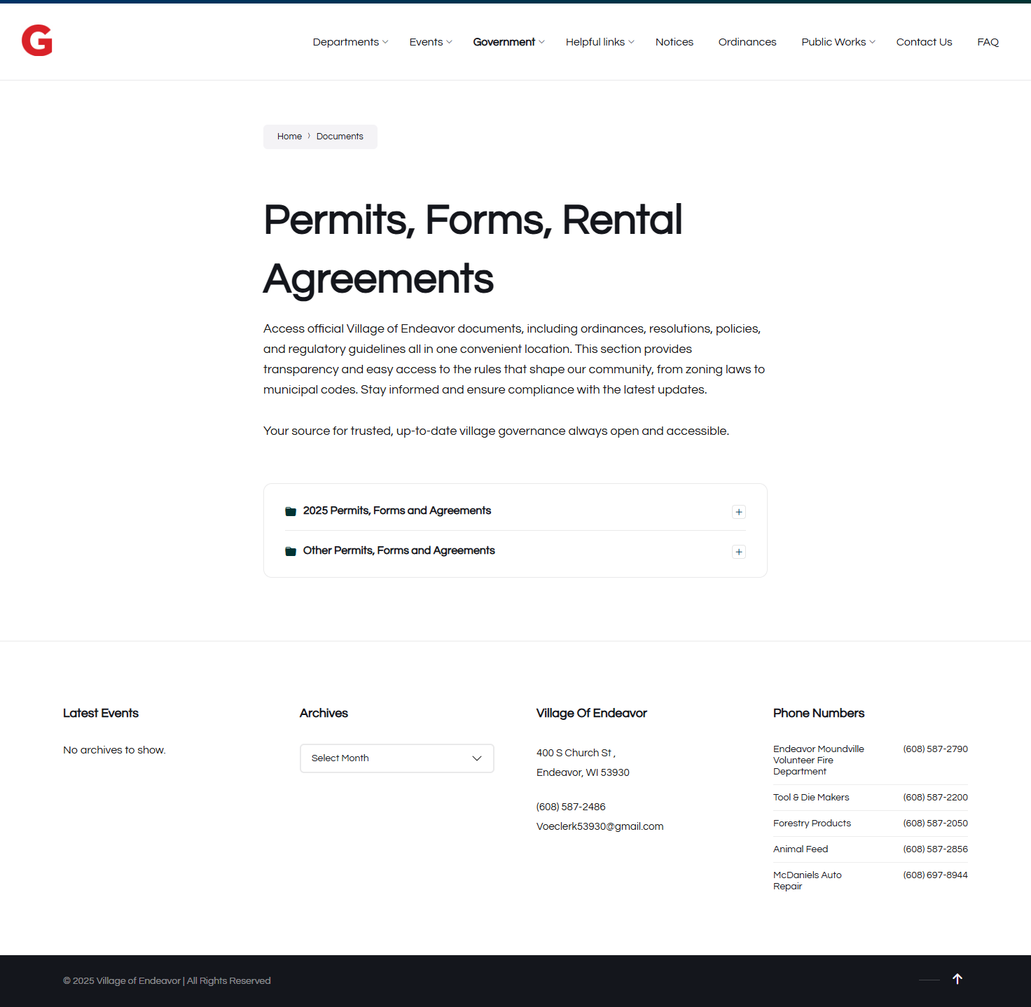
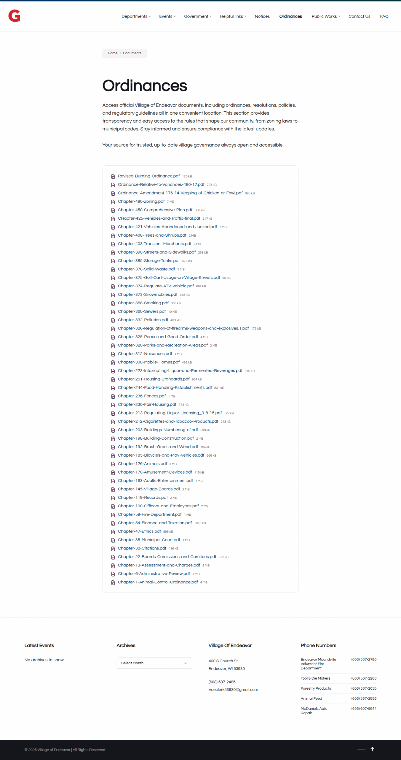
Document categories designed to help users find ordinances without friction.

Permit and form pathways made easier to identify and scan.

Outcome

The redesign direction improves how the community finds and understands civic services.

The redesigned presentation gives the Village of Endeavor a clearer and more accessible digital direction. The structure prioritizes essential services, improves mobile usability, and presents civic information with stronger hierarchy and a more professional visual system.

Task-first IA

Services, documents, and departments are organized around common user needs.

Mobile-first layout

The redesign supports residents accessing information from phones.

Professional civic trust

The interface feels cleaner, more credible, and better aligned with municipal communication.

Recruiter takeaway

A civic UX/UI project that shows research, structure, accessibility, and polished presentation.

This case study shows my ability to translate community needs into a structured, accessible, and visually professional web experience for a public-service audience.