Web Design Case Study

Tesla Landing

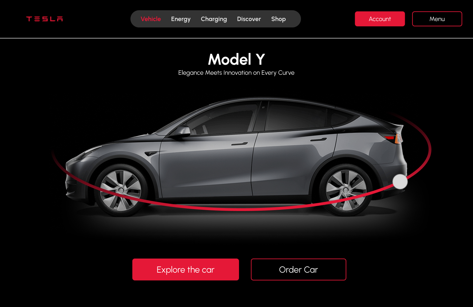
Tesla Landing is a concept web design project focused on a premium automotive landing page experience. The case study reframes the work around product storytelling, strong visual hierarchy, immersive mockups, and a clean interface direction that supports a high-end electric vehicle brand experience.

Landing Page
Product type
Landing Page UI
Design focus
Premium product story
User need
Concept

Landing Page UI support app

Tesla Landing is a concept web design project focused on a premium automotive landing page experience.

Role

Web Designer

Landing Page analysis, content structure, visual hierarchy, UX recommendations, and final presentation design.

Tools

Figma + Landing Page UI

Figma, web UI design, landing page mockups

The challenge

Automotive landing pages need to feel aspirational while still helping visitors understand the product, features, and next action.

Automotive landing pages need to feel aspirational while still helping visitors understand the product, features, and next action. The challenge was to create a presentation that feels premium without sacrificing clarity.

Objective

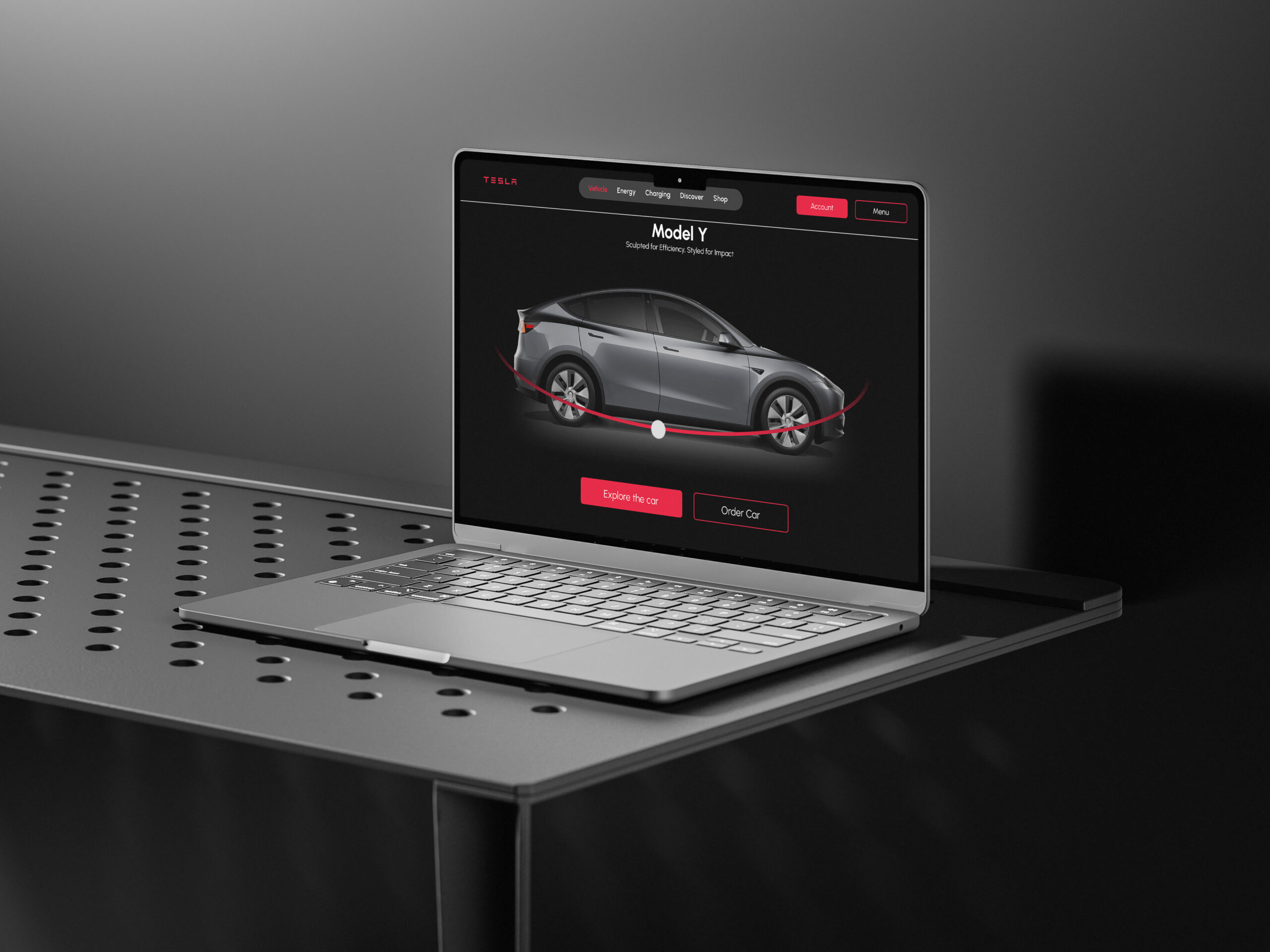
The objective was to design and present a Tesla-inspired landing page concept with bold visuals, clear product emphasis, and polished responsive mockups for portfolio review.

Audience

Prospective car buyers, automotive enthusiasts, product-focused web visitors, and recruiters evaluating premium web layout and visual design ability.

Constraints

The project needed to feel inspired by a recognizable premium automotive brand while remaining a portfolio concept, with emphasis on layout quality, visual polish, and user flow.

Design responsibility

The project needed premium product story, not only polished screens.

I reframed the presentation around the user need: premium product story. The layout now explains the strategy before showing the visual screens.

Selected responsibilities

The new case study makes the automotive web, structure, and design decisions easier for recruiters to evaluate.

Process

From premium product story to polished project presentation.

Step 01

Project framing

I defined the accessibility problem around communication support, resource discovery, and faster connection to nearby care providers.

Step 02

Core flow

I focused the experience around clear support tasks: communication resources, guidance, profile flow, and doctor or care-provider connection.

Step 03

Structure

I organized the product around simple paths so users can understand where to go without scanning dense or stressful interfaces.

Step 04

Visual design

Refined the interface direction around contrast, spacing, and product-led storytelling.

Design decisions

The project direction is built around automotive web, trust, and reduced friction.

For this project, the presentation needs to show how users move from first impression to meaningful action. Each design decision supports clarity, trust, and stronger evaluation.

Premium product story-first product structure

Reason: Automotive web users need to compare important property information quickly.

Impact: The concept feels more premium and brand-led from the first screen.

Minimal content hierarchy

Reason: Landing Page UI-focused products benefit from clear hierarchy, predictable layouts, and reduced visual noise.

Impact: Visitors can scan the key idea and action path faster.

High-contrast presentation

Reason: A premium landing page needs strong visual drama and readability.

Impact: The final mockups feel polished and easier to inspect.

Final work

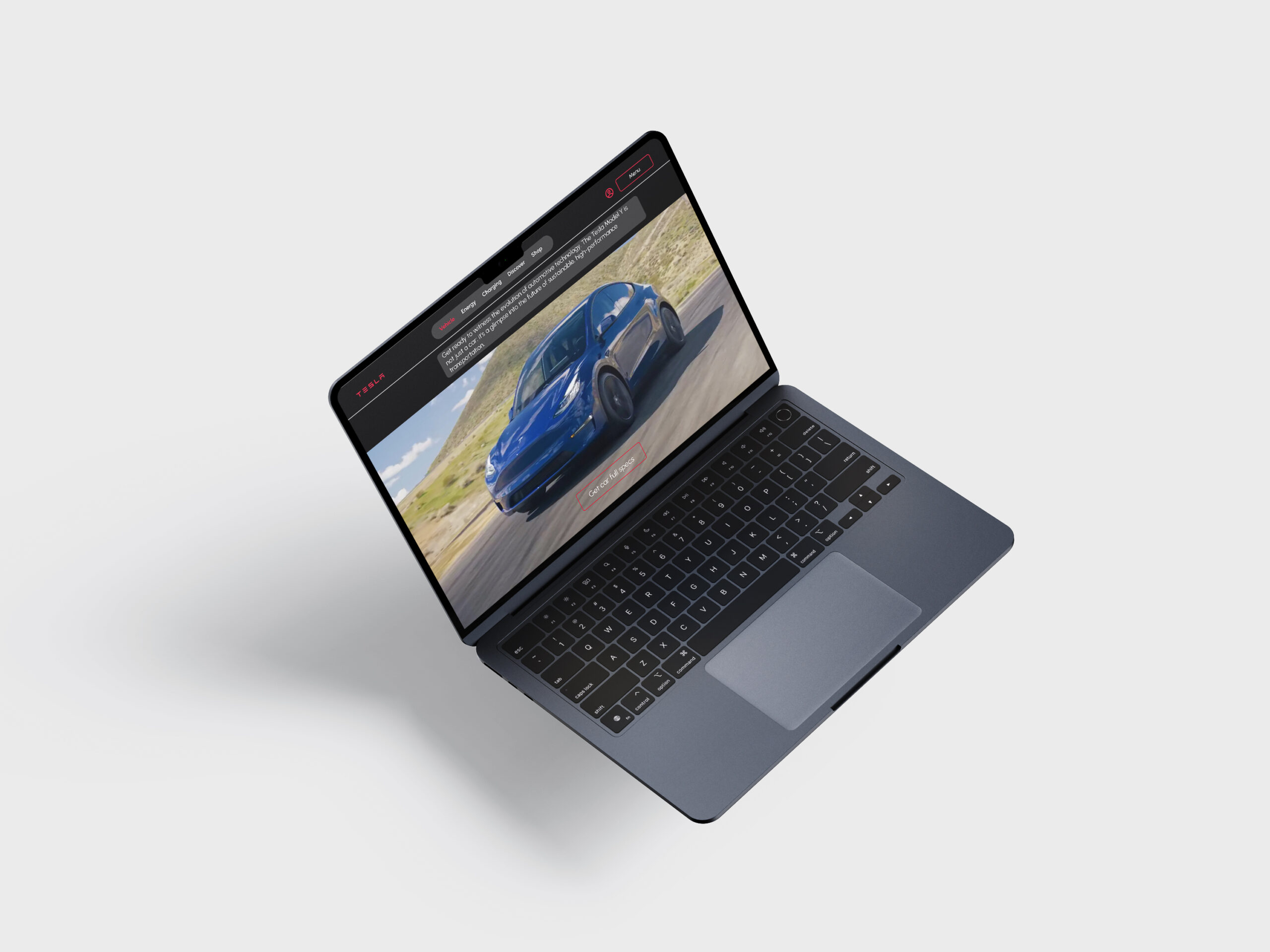
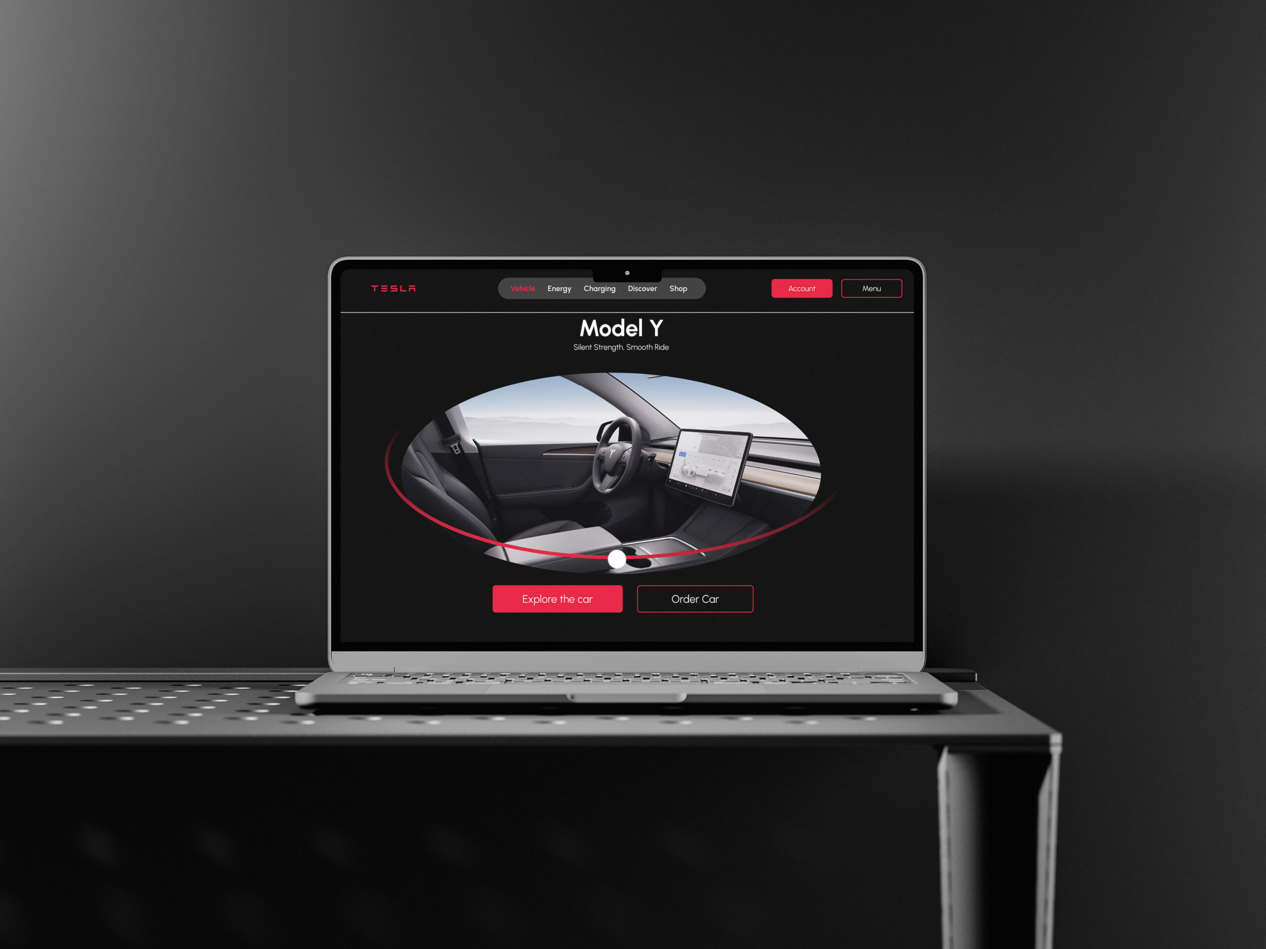
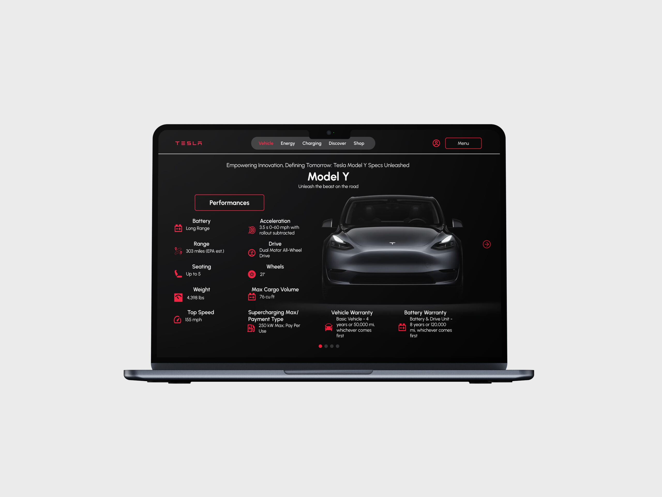
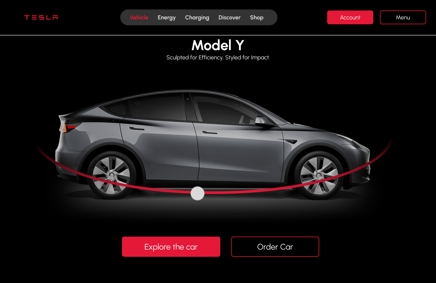
A polished slide-to-case-study presentation using the original Tesla Landing visuals.

Outcome

Tesla-inspired landing page redesign reframed as a modern web design case study.

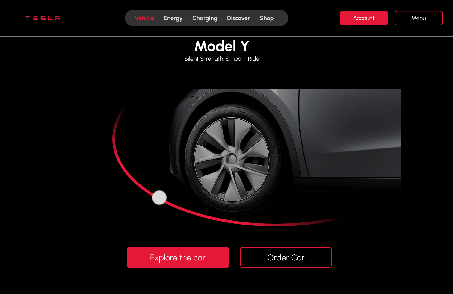
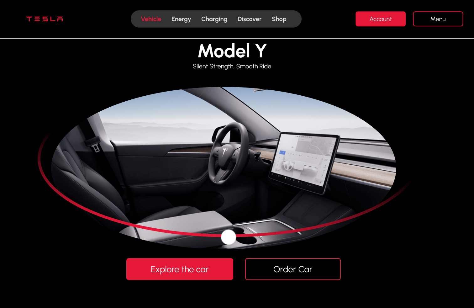
The final Tesla Landing case study presents a clean, premium web concept with strong product imagery, clear hierarchy, and polished mockups that communicate landing-page design ability.

Automotive web discovery

The concept centers the product and user attention.

Landing Page-first listing flow

The final images communicate a refined web presentation.

8 visual screens

The original slide presentation is preserved and reframed into a modern case study.

Recruiter takeaway

A web design case study with clear product framing and polished visual presentation.

This case study shows my ability to design a polished landing page concept with strong visual hierarchy, product storytelling, and premium presentation quality.