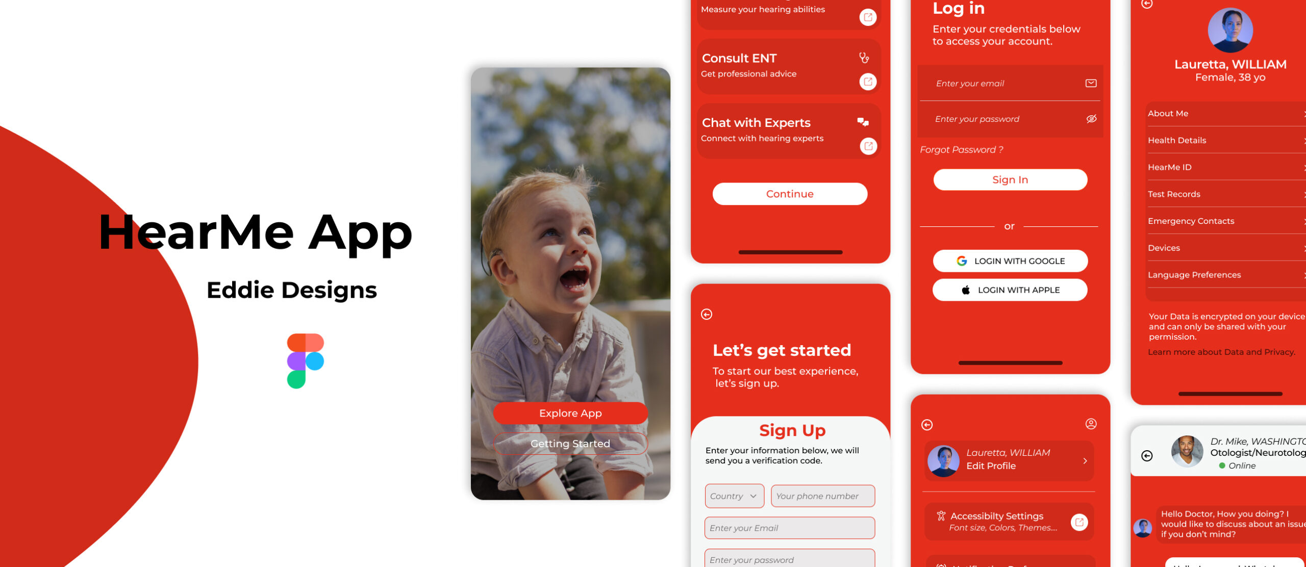
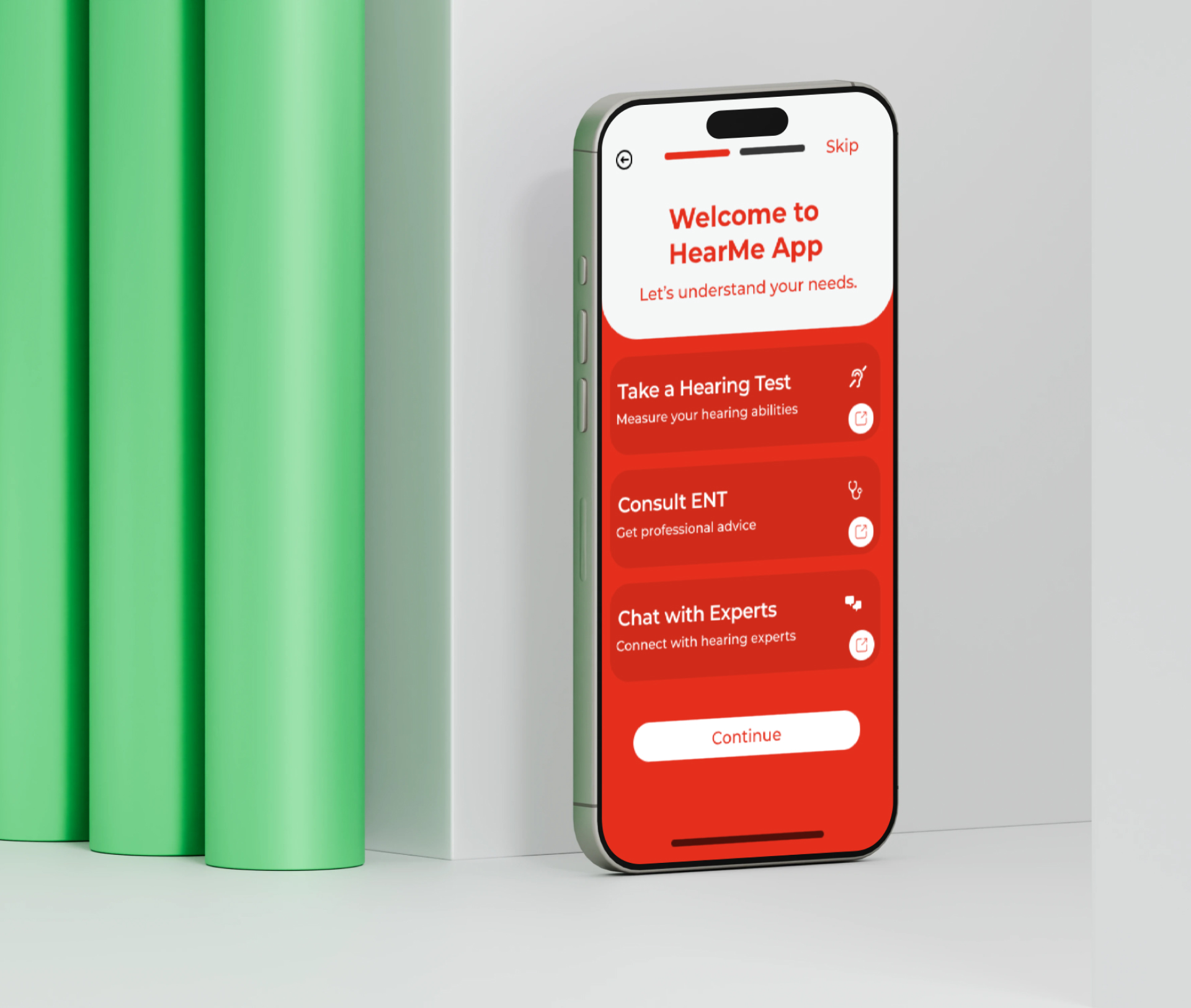
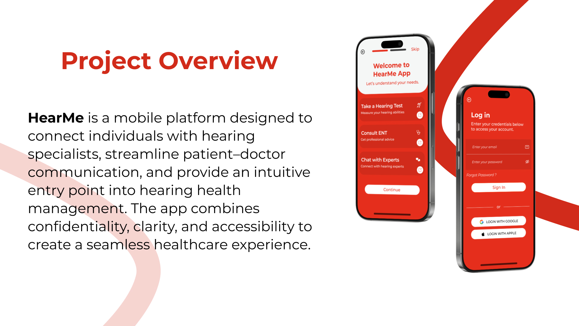
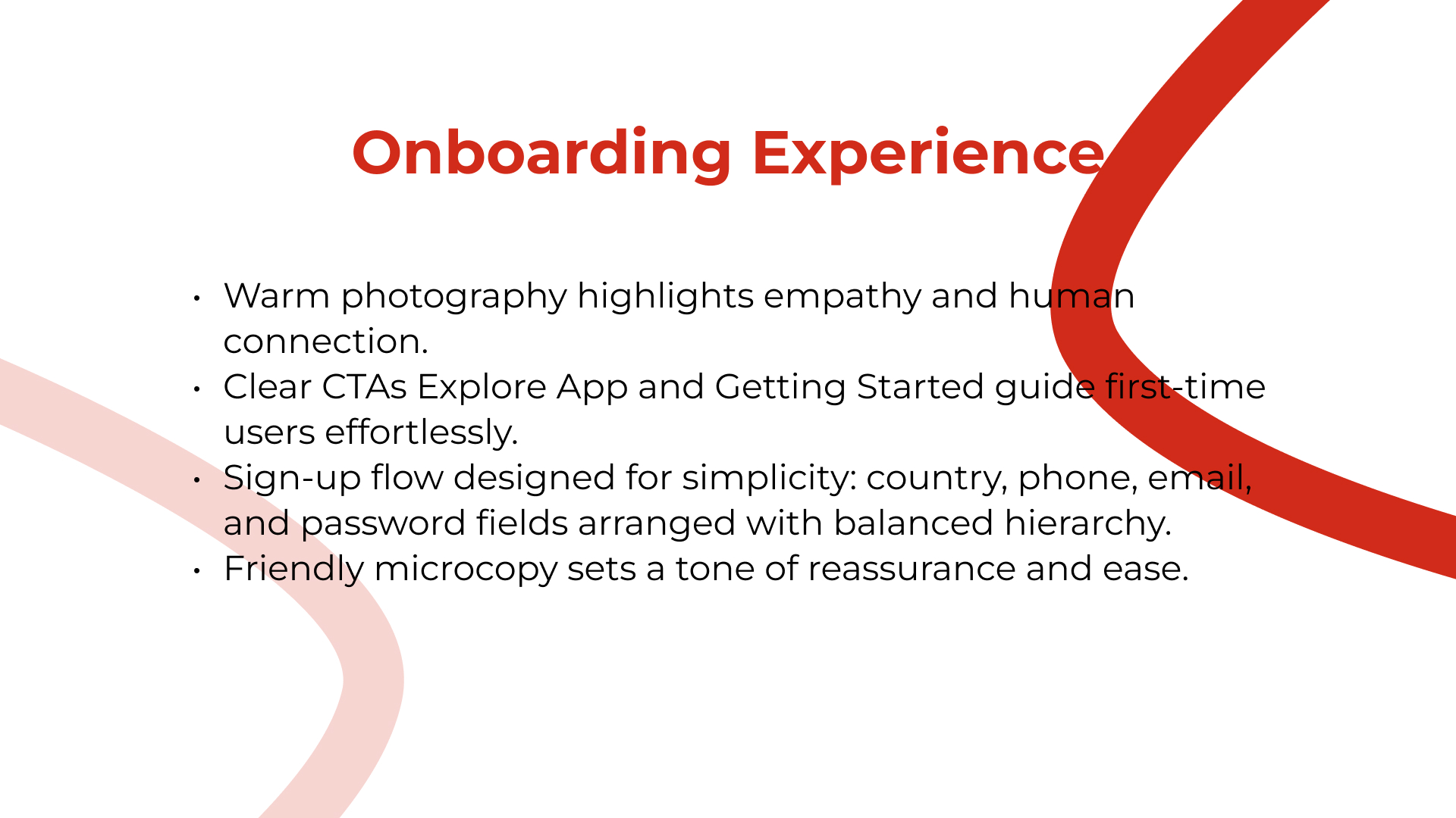
HearMe is an accessibility-focused mobile app concept designed to support people with hearing disabilities through clearer communication tools, helpful resources, and faster connection to nearby doctors or care providers. The project focuses on inclusive UX, simple task flows, and a polished mobile presentation.

A mobile concept for clearer communication tools, hearing-related resources, and faster connection to nearby care providers.
Problem framing, accessibility-focused UX, flow structure, mobile UI direction, and final presentation design.
Figma, accessibility research, presentation design
People with hearing disabilities can face barriers when trying to communicate clearly, find trustworthy resources, or connect quickly with nearby medical support. The challenge was to imagine an app experience that feels supportive, simple, and practical without overwhelming users.
The goal was to design a mobile experience that helps users access communication support, helpful hearing-related resources, and doctor connection pathways through an interface that is calm, clear, and easy to navigate.
People with hearing disabilities, caregivers, family members, support organizations, and users who need accessible communication resources or nearby hearing-care information.
The concept needed to feel accessible and respectful while organizing sensitive information, medical-adjacent guidance, and support features in a way that avoids confusion and reduces cognitive load.
I reframed the presentation around the user need: supportive communication, trustworthy resources, and a direct path to care. The layout now explains the product value before showing the visual screens.
The new case study makes the accessibility and UX decisions easier for recruiters to evaluate.
I defined the accessibility problem around communication support, resource discovery, and faster connection to nearby care providers.
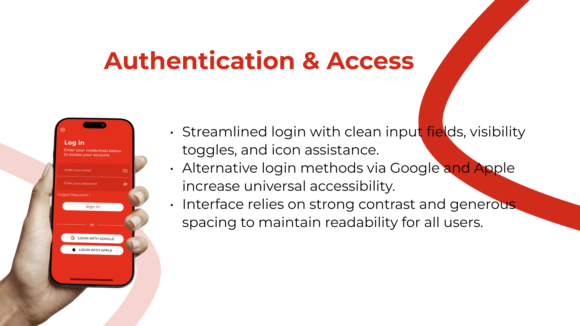
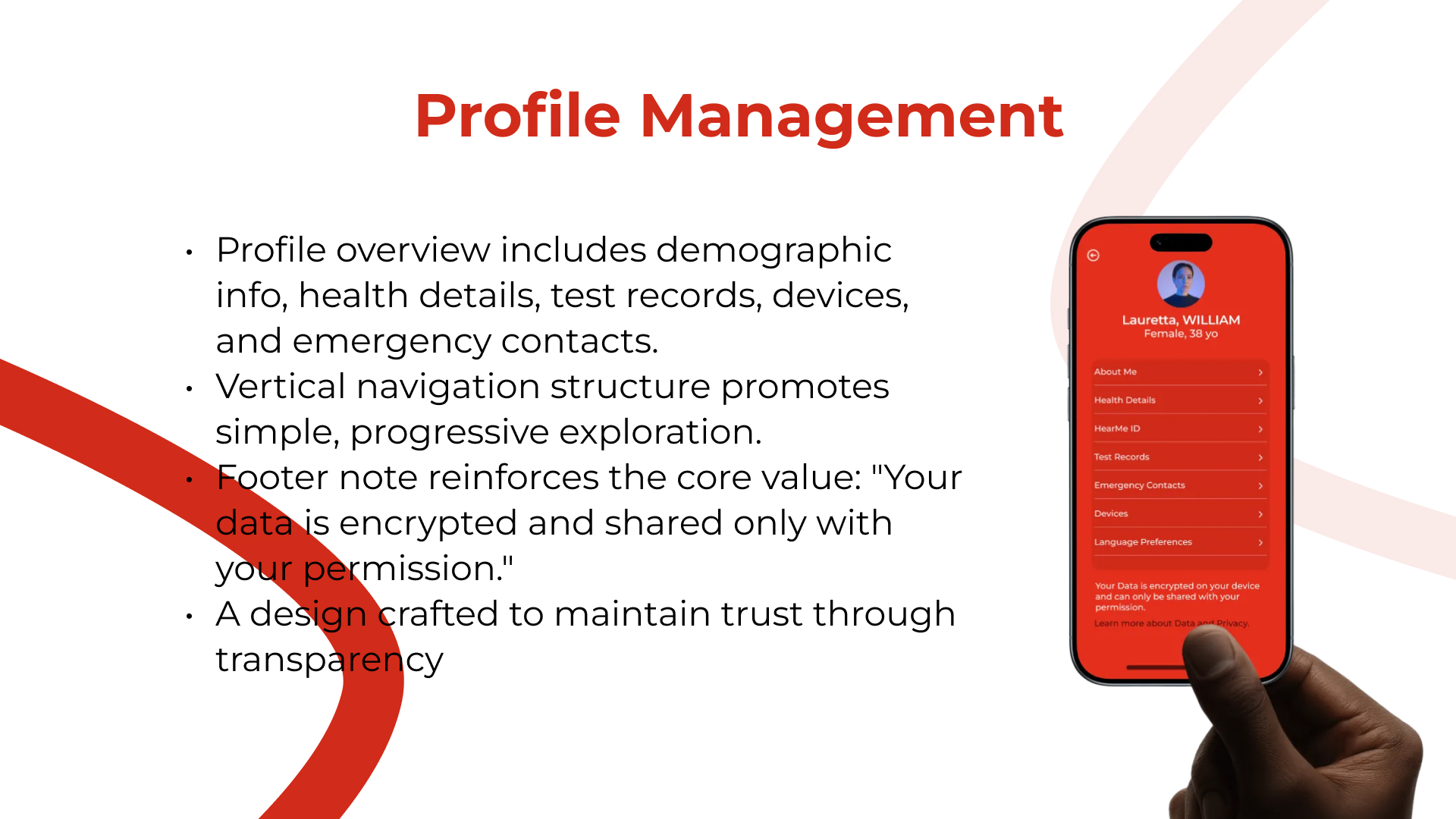
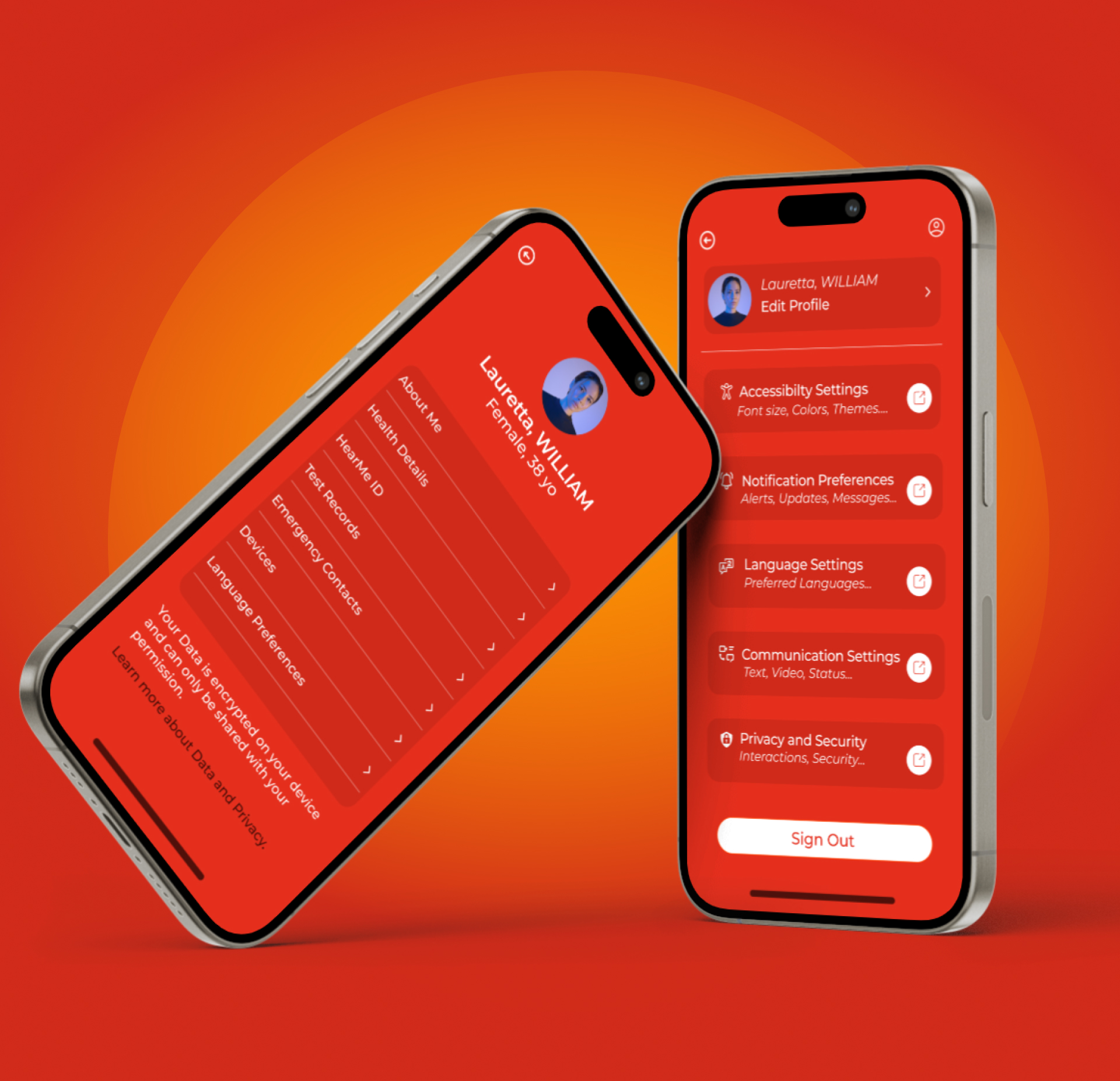
I focused the experience around clear support tasks: communication resources, guidance, profile flow, and doctor or care-provider connection.
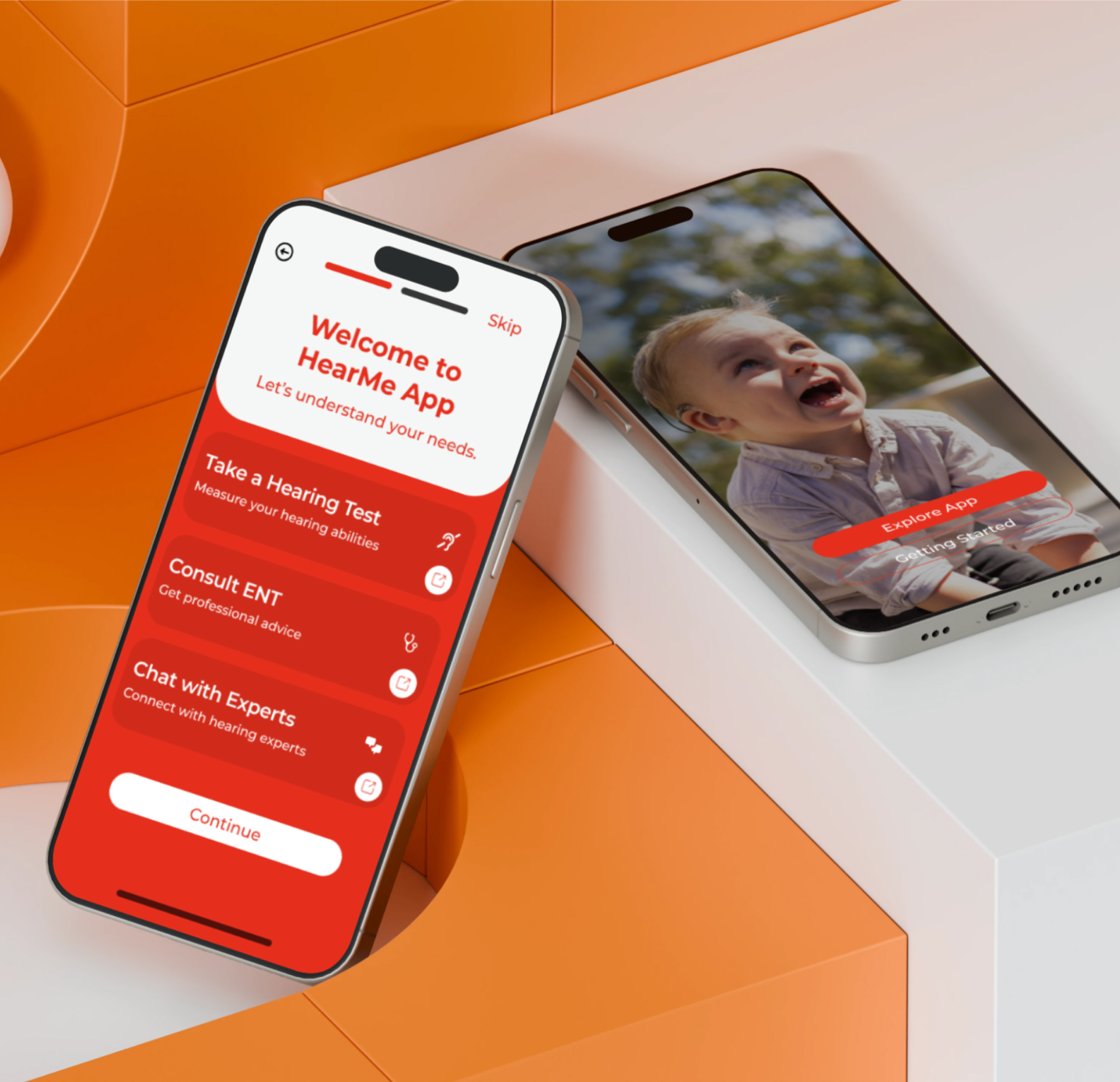
I organized the product around simple paths so users can understand where to go without scanning dense or stressful interfaces.
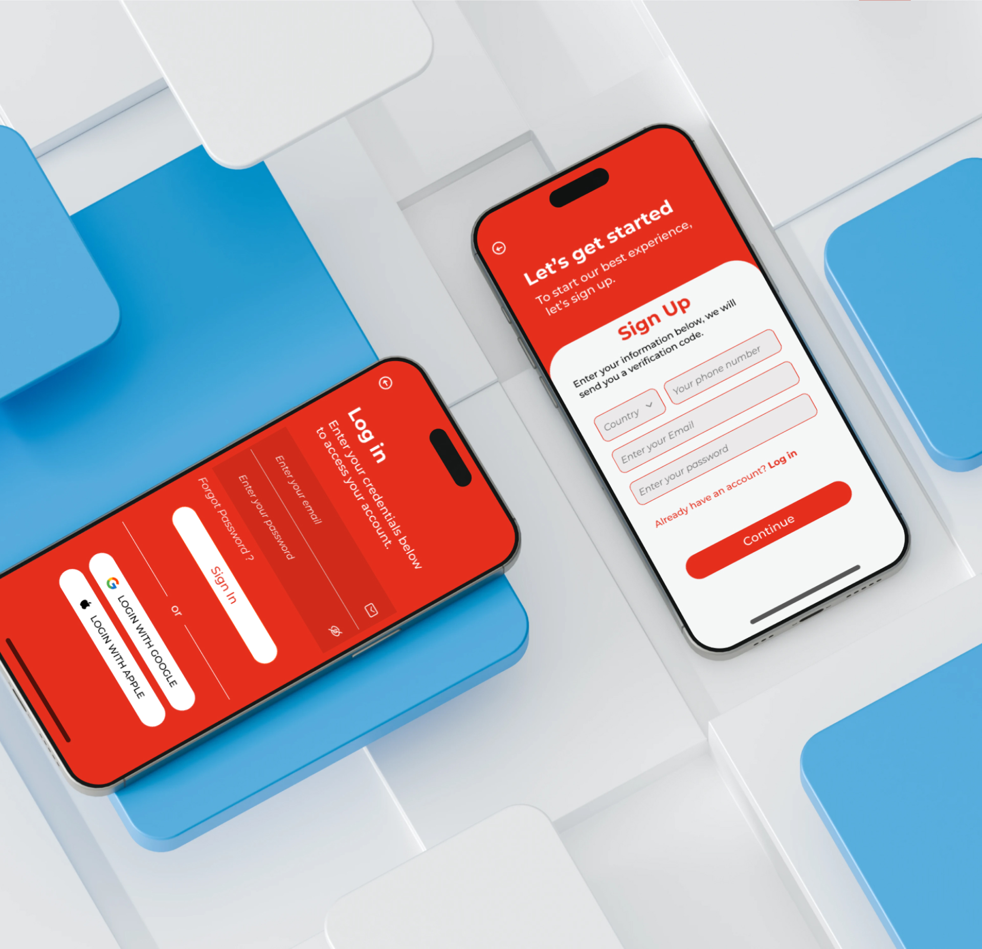
I designed mobile screens with a calm visual direction, clear hierarchy, and accessible interaction patterns for a supportive user experience.
For an accessibility-focused app, the presentation needs to show care in the structure as much as the visuals. Each design decision supports a calmer path to help and information.
Reason: Users need a clear path to help, resources, and care information without unnecessary complexity.
Impact: The concept feels more focused and less overwhelming.
Reason: Accessibility-focused products benefit from clear hierarchy, predictable layouts, and reduced visual noise.
Impact: The UI presentation feels more approachable and easier to scan.
Reason: The portfolio summary highlights quick connection to nearby doctors as a core value.
Impact: The app concept becomes more practical and grounded in real user needs.
The final HearMe concept presents an inclusive mobile experience for communication support and care discovery. The case study now frames the project around accessibility, user confidence, clear navigation, and the practical need to connect users with resources and nearby support.
The project centers users who need clearer communication and support pathways.
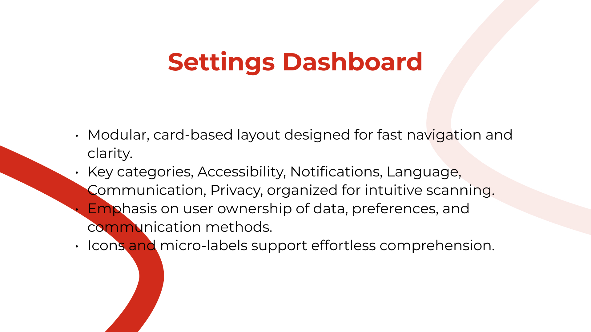
Key features are organized around resources, communication, and care discovery.
The original slide presentation is preserved and reframed into a modern case study.
This case study shows my ability to think through accessibility-focused product design, organize supportive user flows, and present a mobile app concept with a polished visual system.