Web Design Case Study

Diastoavie Web

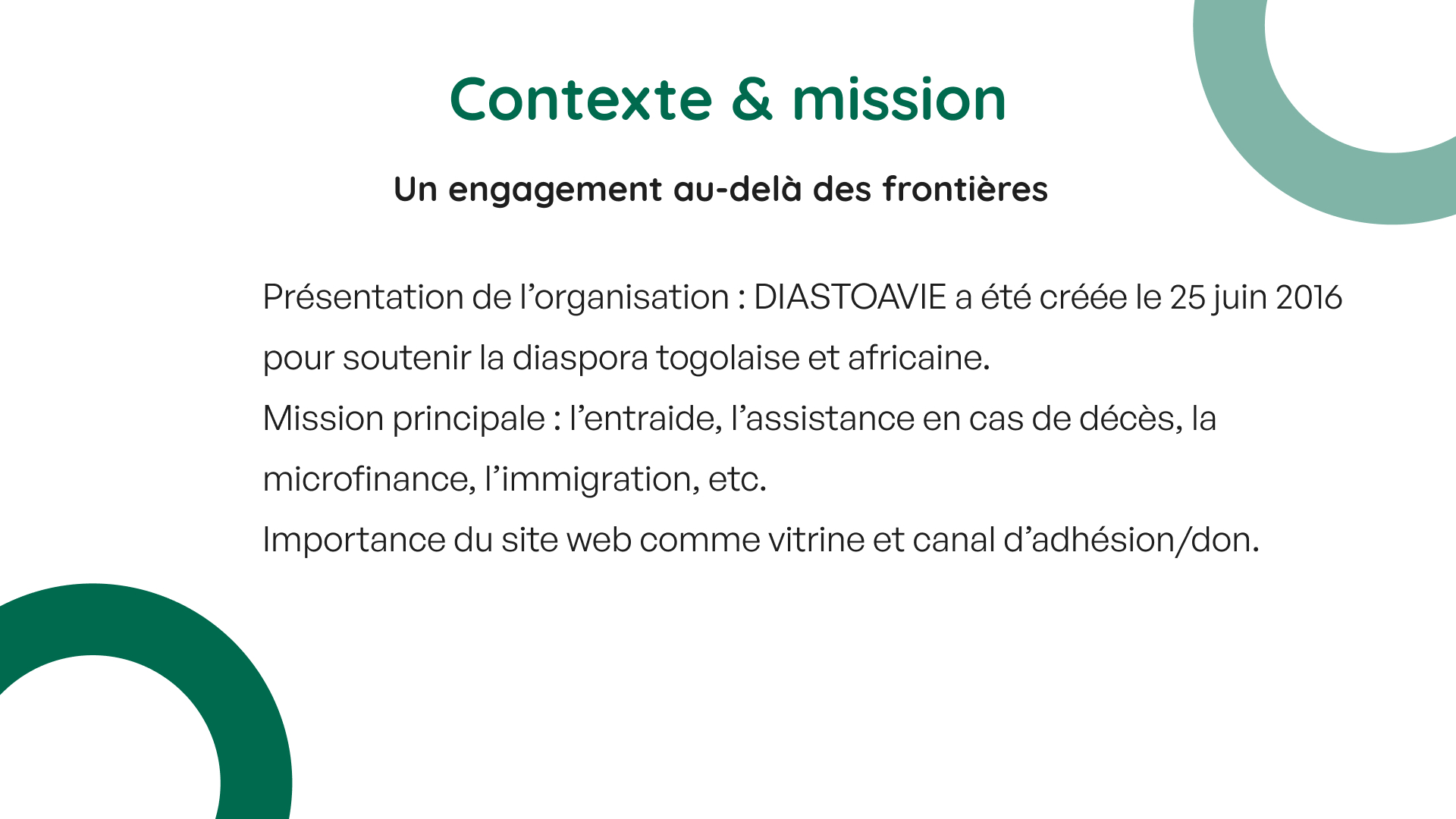
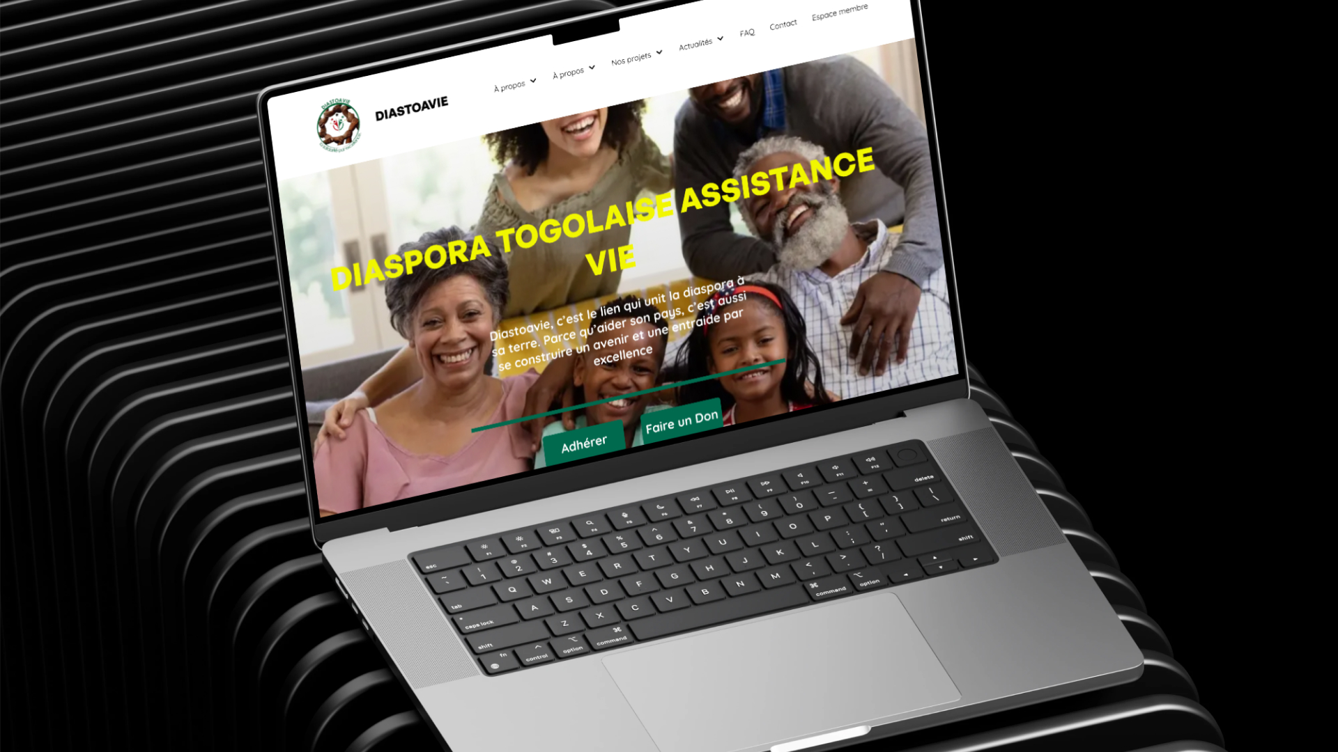
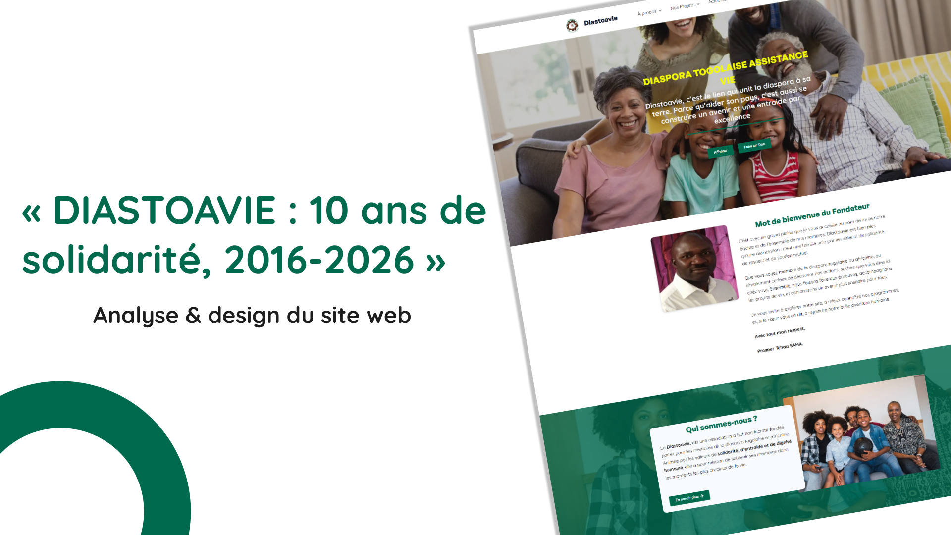
Diastoavie is a web presentation project for an organization supporting the Togolese and African diaspora. The case study reframes the website around mission clarity, membership growth, donation pathways, service visibility, and a stronger digital presence for community engagement.

Website
Product type
Website UI
Design focus
Community services
User need
Concept

Website UI support app

A website presentation for a diaspora organization, focused on services, membership, donations, events, and stronger community storytelling.

Role

Web Designer

Website analysis, content structure, visual hierarchy, UX recommendations, and final presentation design.

Tools

Figma + Website UI

Figma, WordPress, Elementor, UX analysis

The challenge

Making a broad community mission easier to understand and act on.

Diastoavie needed a website presentation that could communicate a broad mission without overwhelming visitors. The organization supports membership, death assistance, microfinance, immigration help, events, and donations, so the challenge was to make the structure easier to understand and the calls to action more visible.

Objective

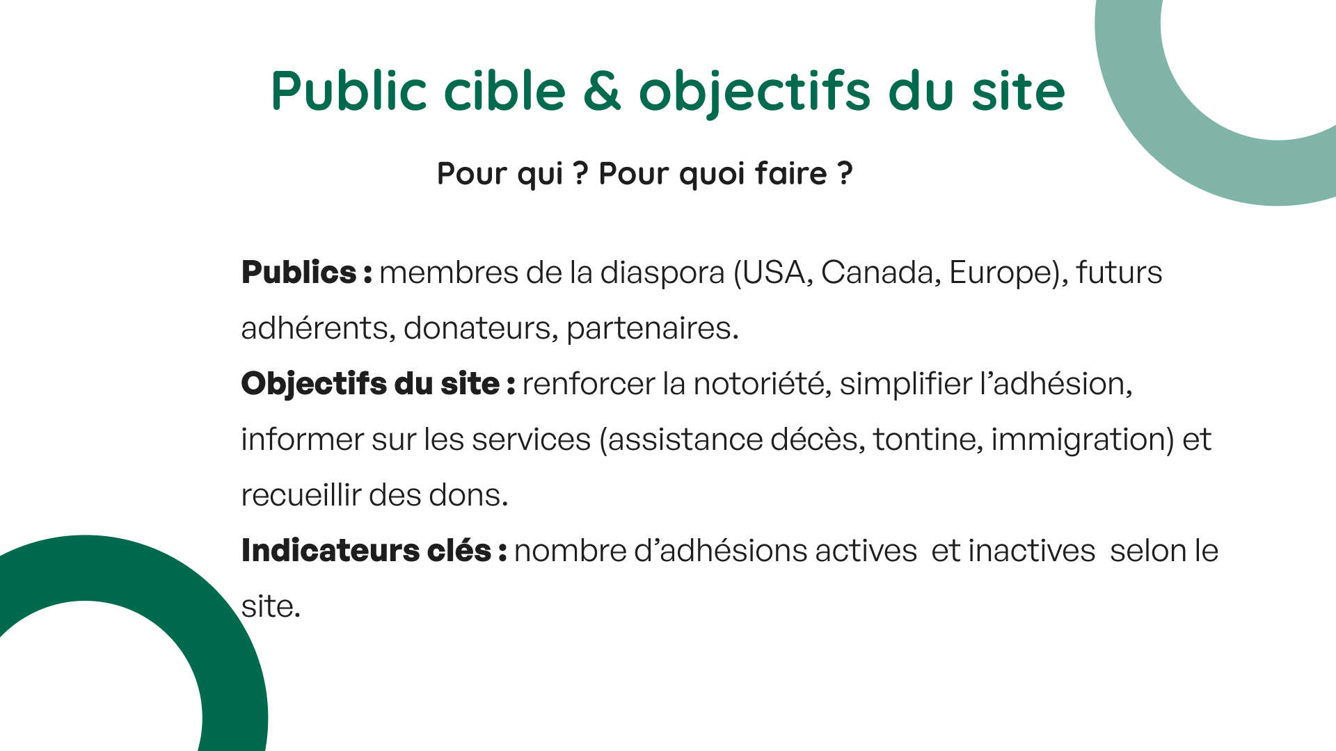
The objective was to present the website as a clearer digital hub for awareness, membership, donations, and community services while identifying improvements for hierarchy, storytelling, accessibility, and engagement.

Audience

Members of the Togolese and African diaspora in the United States, Canada, Europe, future members, donors, community partners, and families looking for support services.

Constraints

The presentation had to organize many service areas, make a community mission feel trustworthy, preserve important association information, and recommend improvements without losing the human story behind the organization.

Design responsibility

The project needed mission clarity, not only website screenshots.

I reframed the presentation around the visitor need: understand the mission, find services, join the association, donate, and trust the organization. The layout now explains the strategy before showing the visual screens.

Selected responsibilities

The new case study makes the mission, website structure, and strategic recommendations easier for recruiters to evaluate.

Process

From community mission to clearer website presentation.

Step 01

Mission review

I defined the accessibility problem around communication support, resource discovery, and faster connection to nearby care providers.

Step 02

Audience mapping

I focused the experience around clear support tasks: communication resources, guidance, profile flow, and doctor or care-provider connection.

Step 03

Navigation review

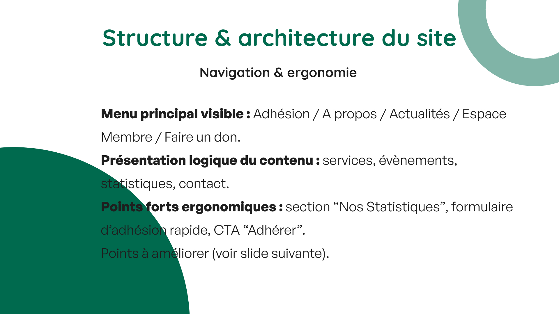
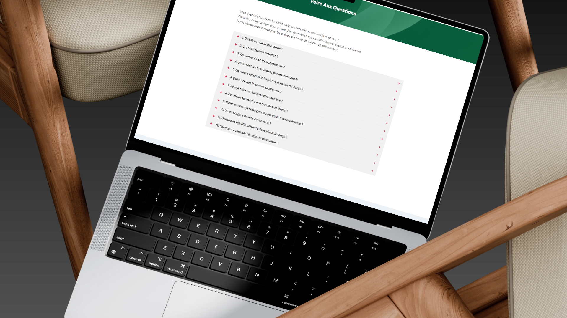
I organized the product around simple paths so users can understand where to go without scanning dense or stressful interfaces.

Step 04

Hierarchy review

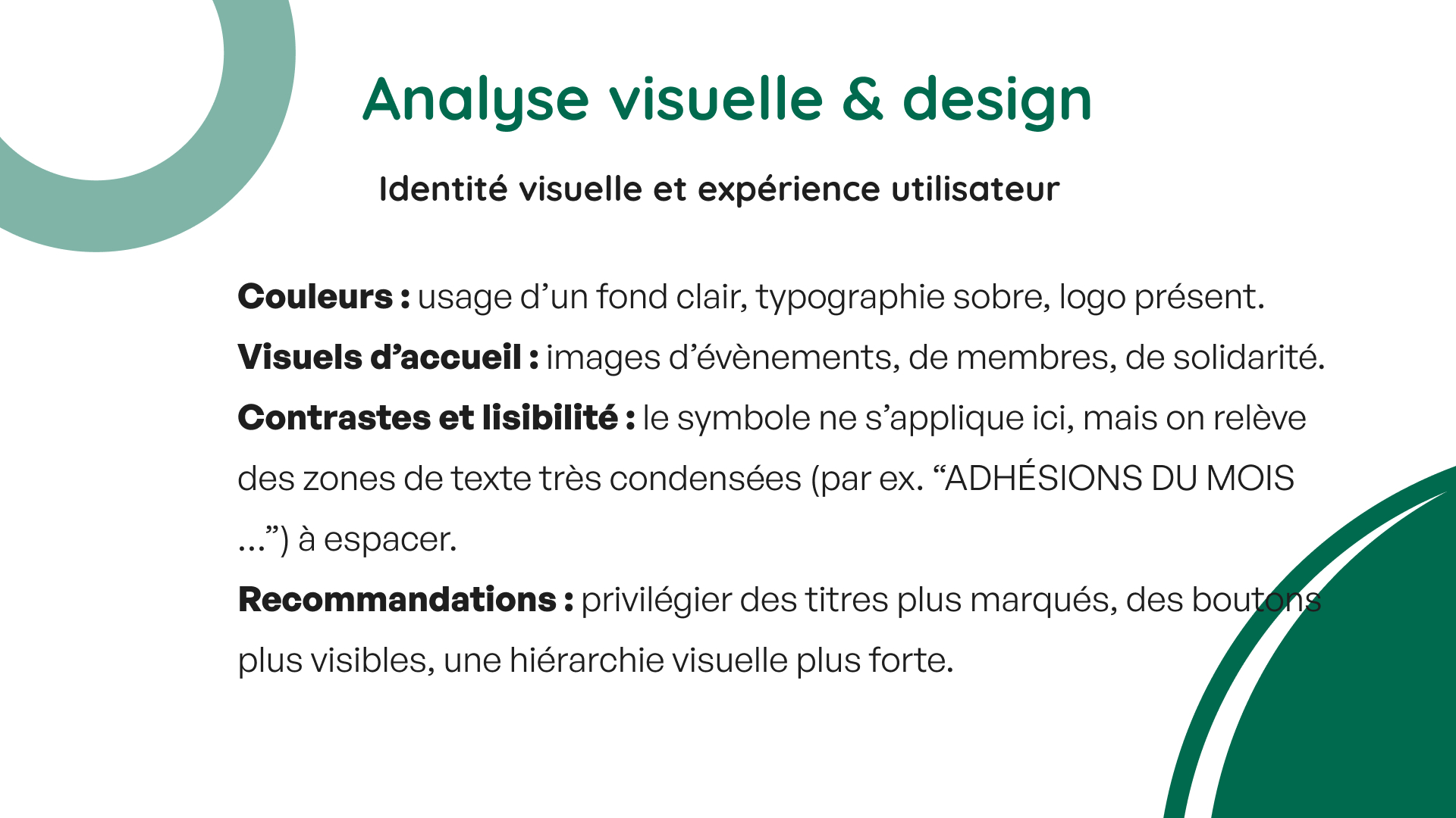
Identified opportunities to improve spacing, headings, button visibility, contrast, and the presentation of key community visuals.

Design decisions

The website direction is built around mission clarity, trust, and reduced friction.

For a community organization website, the presentation needs to show how visitors move from understanding the mission to joining, donating, or asking for help. Each design decision supports clarity and trust.

Community services-first product structure

Reason: Diaspora users need to compare important property information quickly.

Impact: The case study makes the organization’s purpose and service model easier to evaluate.

Community storytelling emphasis

Reason: Website UI-focused products benefit from clear hierarchy, predictable layouts, and reduced visual noise.

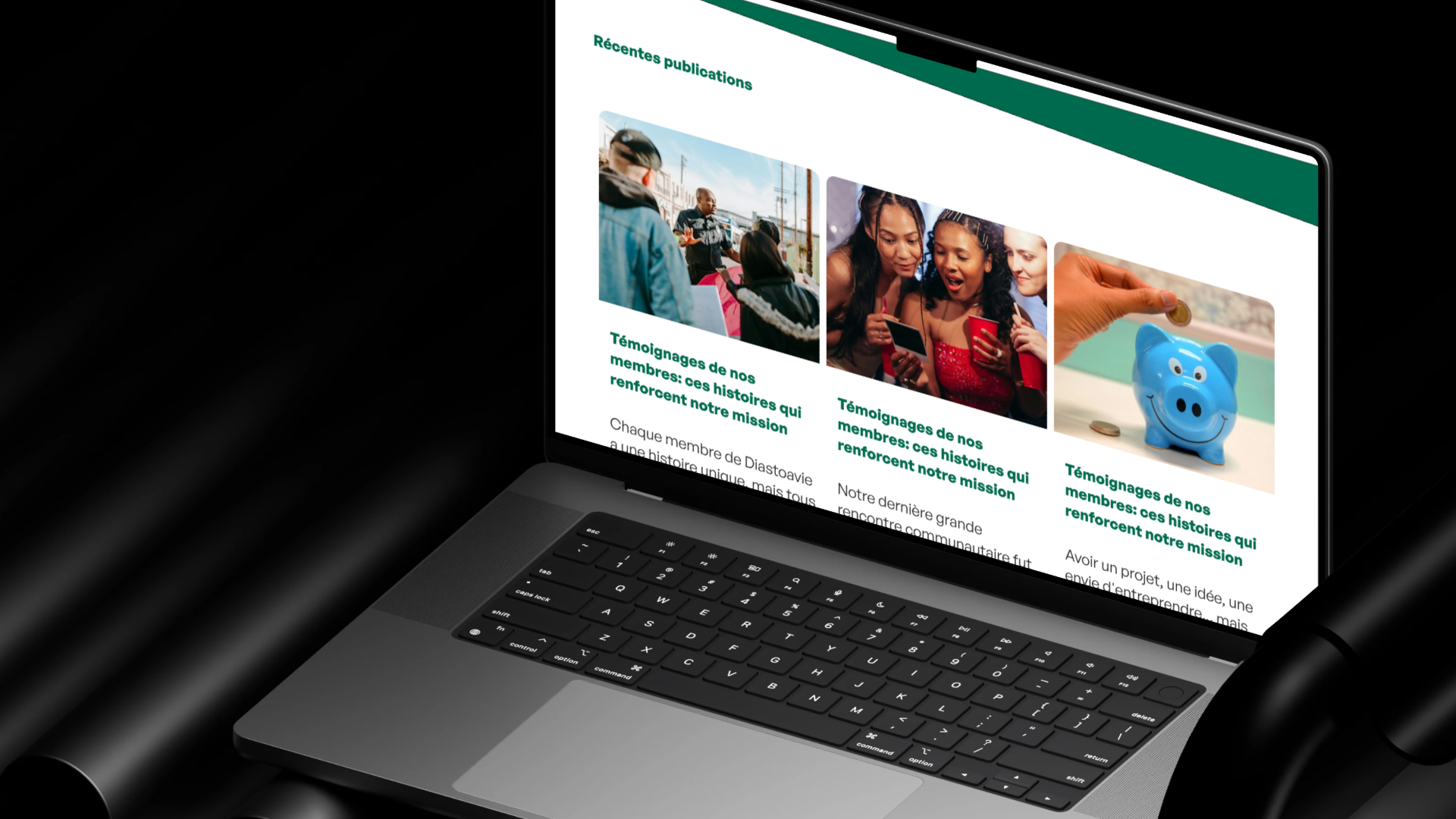
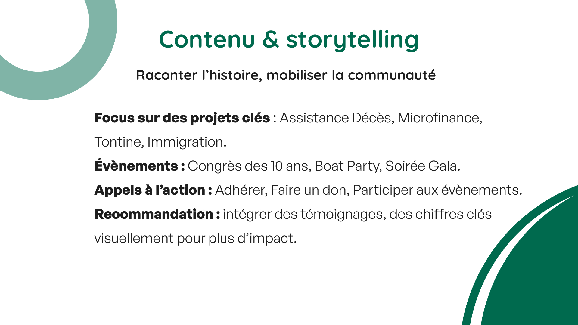
Impact: Testimonials, events, and key figures become important recommendations for a stronger next version.

Clearer membership and donation paths

Reason: The site serves both active community members and potential supporters.

Impact: Calls to action become more purposeful and tied to user intent.

Final work

A polished slide-to-case-study presentation using the original Diastoavie visuals.

Outcome

A community organization website reframed as a modern web design case study.

The final Diastoavie case study presents the website as a community-focused digital hub with a strong mission and clear improvement path. It highlights the organization’s purpose, audience, navigation, content priorities, visual hierarchy, and recommended next steps for a more modern and engaging version.

Diaspora discovery

The project clarifies services for members, donors, partners, and families.

Website-first listing flow

The presentation connects website structure to the actions Diastoavie needs visitors to take.

13 visual screens

The original slide presentation is preserved and reframed into a modern case study.

Recruiter takeaway

A web design case study with clear mission framing and polished visual presentation.

This case study shows my ability to evaluate a content-rich organization website, clarify user goals, improve information hierarchy, and present strategic design recommendations in a polished way.